Best practices for logo size and design to print on beauty products
Make your logo print-ready in minutes—learn how.
You’re excited to see your beauty or skincare products with your logo printed, but when you finally get your products in hand, you realize your logo size and design doesn’t look as good as you thought. It’s either too complicated, too small, or simply the wrong color.
So, how do you prevent that from happening? You’ve come to the right place.
In this article, you’ll find some logo design best practices, including logo size guidelines, file types, key principles, and some printing options to ensure your logo looks great when printed on any product.
Here are the top 5 best practices to make sure your logo prints beautifully:
- Keep it simple: understand logo size and design basics
- Scalability: bold but simple
- Color: consider the background
- Saving and exporting your logo: file types and more
- Know your printing options
1. Keep it simple: understand logo size and design basics
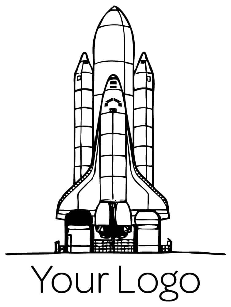
Vector files
Your logo should be eye-catching with bold lines and a simple design. This helps it remain legible on smaller products like lip pencils or eyebrow pencils.
The simpler the logo, the clearer it prints. A bold design will look elegant and readable in any color.
2. Scalability: bold yet simple
Logos must scale well to fit both large and small products. Thin lines may not be visible at smaller sizes.
Tip 1: Avoid thin lines
Logos with thin strokes may look great on screens but are hard to read when printed small.


Thicker lines improve clarity on all product sizes:


Tip 2: Choose a bold font
Thin fonts can disappear at small sizes:


Small products like pencils make thin fonts nearly unreadable:


Tip 3: Use solid graphics
Simple shapes print better. Avoid detailed outlines:


3. Color: solid is better
Consider the background
How does your logo look on various product backgrounds? Avoid gold on coral or purple on hot pink.

Avoid gradients
Gradients can appear messy. Solid colors are timeless and print better.


💡 Blanka Tip: Stick to black and white logos for maximum versatility.
4. Saving and exporting your logo
Vector files
Always export your logo as a vector image (ai, .eps, .svg). These scale perfectly without losing quality.
Vector vs Raster
Raster images like .jpg or .png pixelate when resized. Vectors don’t:
Pixels and logo size variations
Prepare different size variations (horizontal, square, vertical). Define minimum sizes and avoid extra whitespace.
Cropped version:
5. Know your printing options
Option 1 – Direct Printing
Direct printing offers durable, premium finishes.

Option 2 – Labels or Stickers
Labels are cost-effective but may look less premium.

Conclusion
Logo design best practices help ensure your products look amazing. Keep your logo bold, simple, and vectorized.
💡 Blanka Tip: Need help? Hire Blanka’s logo design team!
Ready to start private labeling? Sign up and receive mockups within a day!
START FREE
START PRIVATE LABELING WITH BLANKA